• The Challenge
High drop-off. Low clarity. Hidden value.
We discovered that Privilee’s existing website confused users rather than converting them. The value proposition wasn’t clear, important content was buried, and the design didn’t inspire trust. Mobile performance was especially critical, with 80% of users accessing from their phones – yet most dropped off before converting.


• The Vision
A confident, conversion-ready experience.
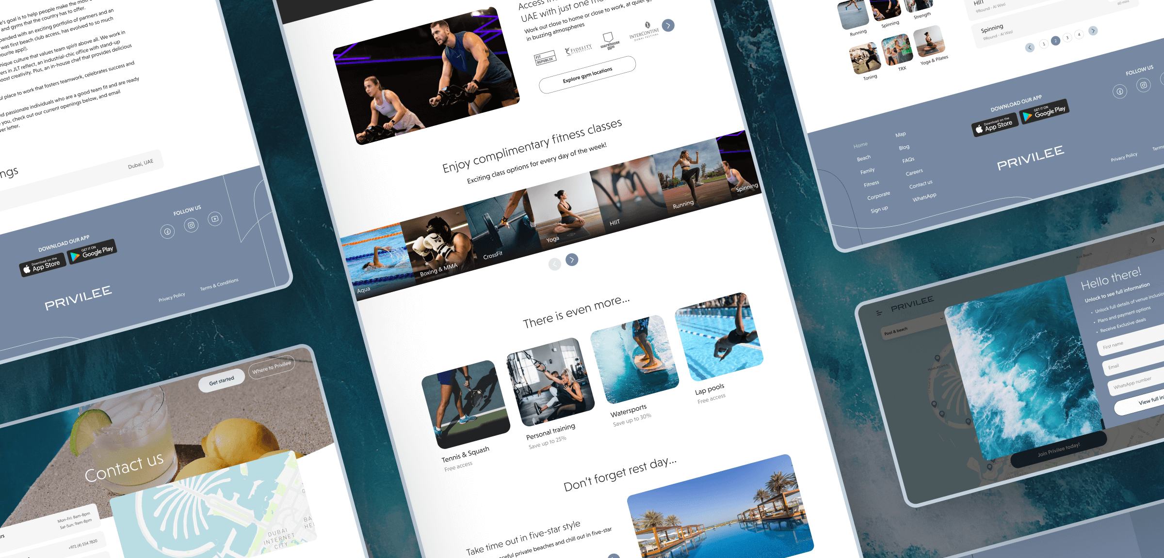
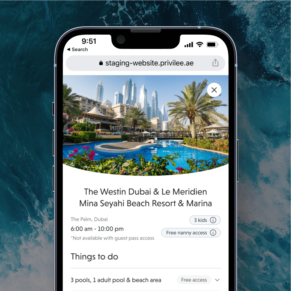
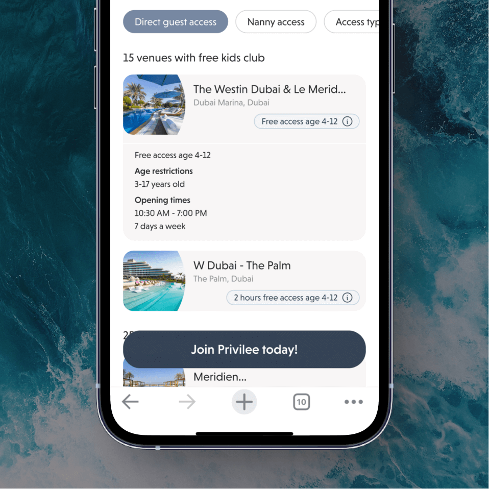
We aimed to design a modern, transparent website that clearly communicates the value of Privilee’s memberships. From simplified navigation to a mobile-first experience, every decision was focused on removing friction and building user confidence – all while creating excitement around the brand.
• Our Approach
Research, redesign, and real-world validation.
We kicked off with discovery sessions, user interviews, and analytics analysis to uncover user pain points. We then redesigned the information architecture, mapped new user flows, and created a content-driven layout that answers user questions at every step. Usability testing guided key iterations, especially on mobile.

• The Result
A high-converting, mobile-first website that brings Privilee’s value to life.
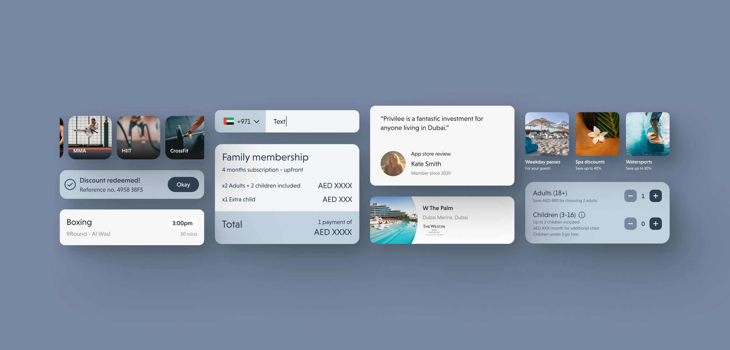
We transformed Privilee’s website into a strategic conversion tool – not just a marketing site. With improved structure, clearer messaging, and a seamless mobile experience, users now understand what Privilee offers within seconds. Navigation is intuitive, the buying journey is simplified, and the platform feels as premium as the membership itself.
